Carnegie Math Pathways
Challenge
A national network of educators and researchers quickly expanded to serve over 90+ colleges across the US. They needed a brand identity and external website to garner support and register more colleges to teach innovative curricula.
Outcome
A new brand identity, and the first external facing website which continues to generate leads of new colleges and universities to teach the Carnegie Math Pathways curricula.

Background
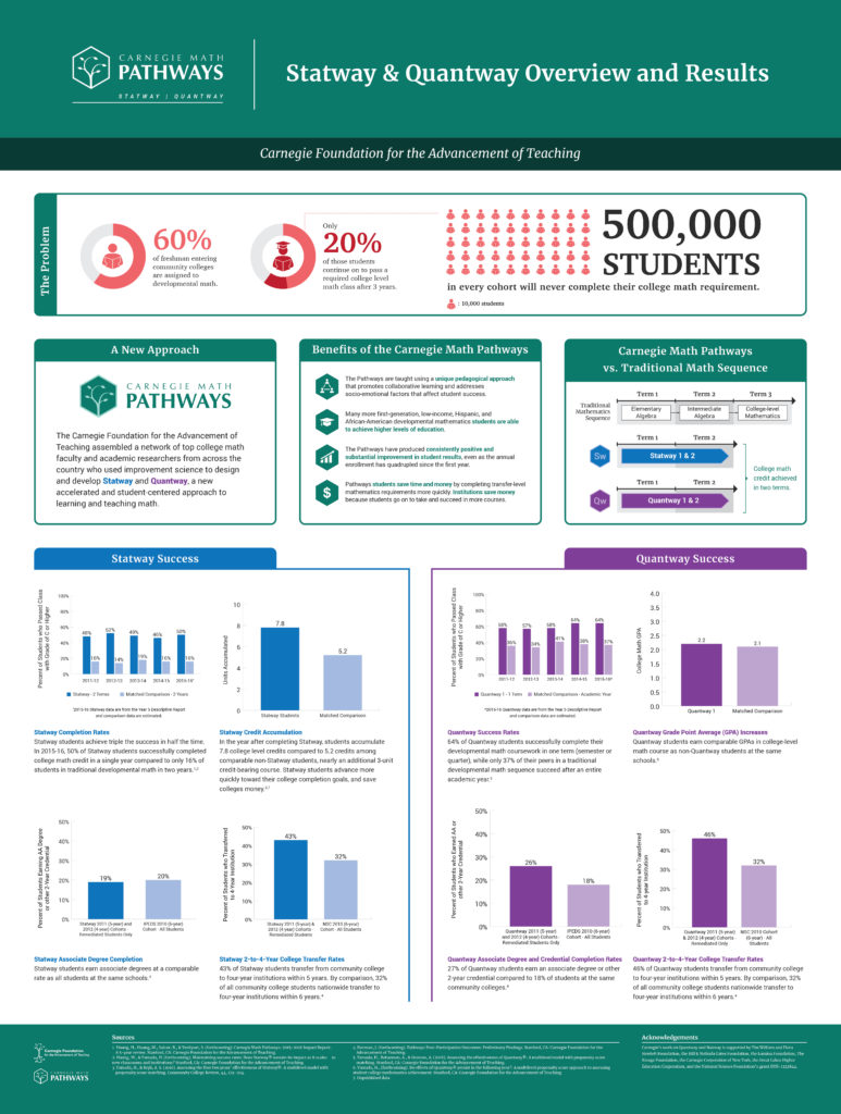
Each year, an average of 500,000 students do not complete a college level math course, thus creating a barrier to reaching their academic and career goals.
So the Carnegie Foundation developed the Carnegie Math Pathways, "Pathways" for short. This initiative has improved student outcomes by developing an accredited and innovative set of Statistics and Quantitative Reasoning currricula that supports career readiness, builds confidence in mathematics, and offers a clearer pathway to transferring to a 4 year university.
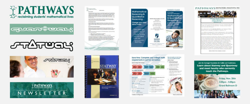
In the early stages of creating offerings for colleges, the Pathways brand lacked cohesion since materials and messaging were designed ad-hoc and out of sync. As the network expanded, a new brand identity that could grow alongside the network was needed so that educators and advocates could represent the Pathways network accurately, professionally, and cohesively.
My Role
Visual Designer, UI/UX Designer
Deliverable
Branding and guidelines, Public website
Product Impact
Website generated leads which grew the network from 60 to 90+ colleges. Brand assets and website codebase remains intact and handed off to a new organization.
Timeline
6 months
Auditing existing materials
To learn more about the problem of the disjointed and fragmented materials, I conducted an audit of existing materials. Through the audit, I was able to better understand the current state of things and begin thinking about a more systematic approach to rebranding the Pathways.
Involving key stakeholders
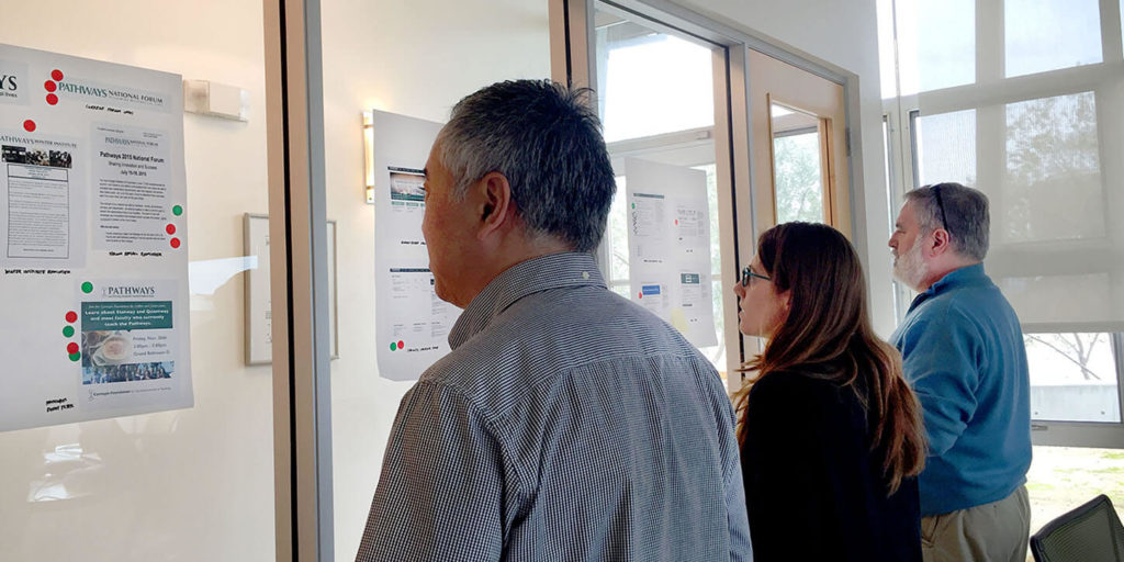
To explore the problem space further, I facilitated branding workshops with key stakeholders to identify a new direction for the Pathways’ visual identity. This process allowed me to understand the diverse perspectives and bring the group to consensus.
Extracting key insights
From my initial audit and branding workshops, I synthesized my learnings into the following insights.
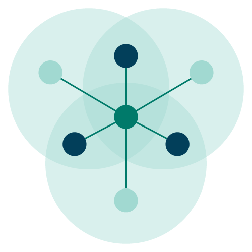
Connect and Distinguish
Viewers need to visually connect AND distinguish a suite of multiple Pathways curriculum products.

Shared United Voice
Advocates need guidance in representing the Pathways accurately across varying contexts.
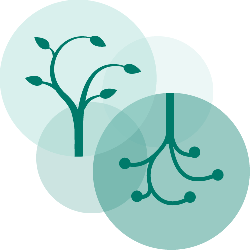
Carnegie Connection
Pathways needs a visual connection to the Carnegie Foundation since the program will spin off.
Sketching logo ideas
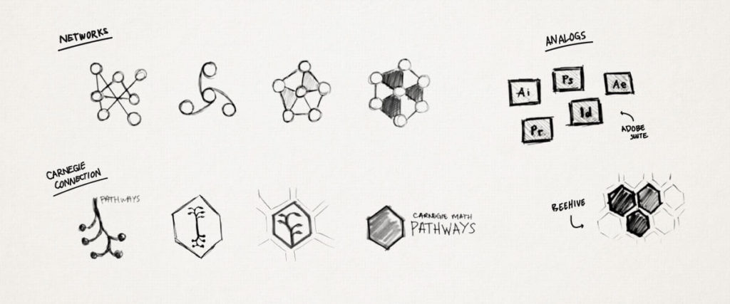
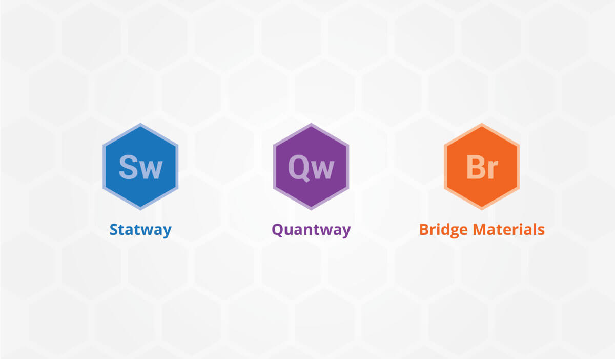
I started by sketching different icons and shapes to represent a network. I also investigated other brands, such as Adobe, that also consist of a suite of products. This investigation provided a good analog and springboard for the new Pathways logo. Eventually, I used hexagons, which naturally connect to other hexagons (e.g. beehives), to represent each curriculum product. Thus, I was able to connect each Pathways product by shape while distinguishing them by color.
Telling the story of the final logo design
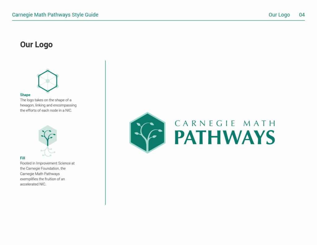
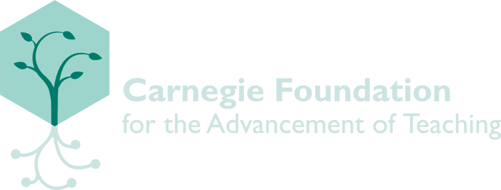
Embedded in final Carnegie Math Pathways logo is the story of its form. The shape imagery and color are derived from ideas that encapsulate important parts of the Carnegie Foundation, from which the Carnegie Math Pathways was founded.


Shape
The logo takes on the shape of a hexagon, linking and encompassing the efforts of each node in a networked community.
Imagery
Rooted in continuous improvement at the Carnegie Foundation, the Pathways maintains the tree to exemplify the fruition of a network.

Color
To further maintain a connection to the Carnegie Foundation, the Pathways logo utilizes a similar green color palette.
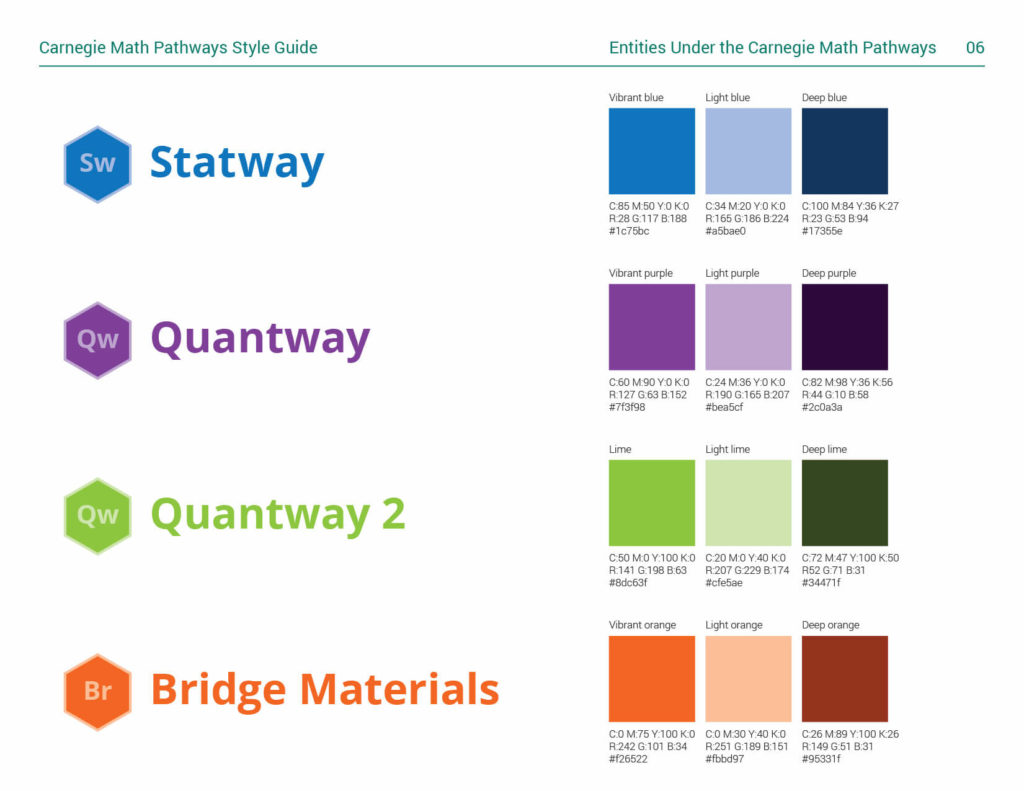
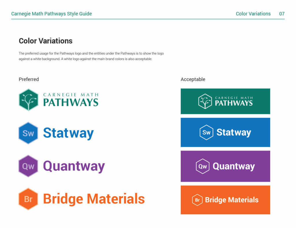
The logos for the Pathways curricula share the hexagon shape and are distinguishable by color and their first two letters.
Public Website
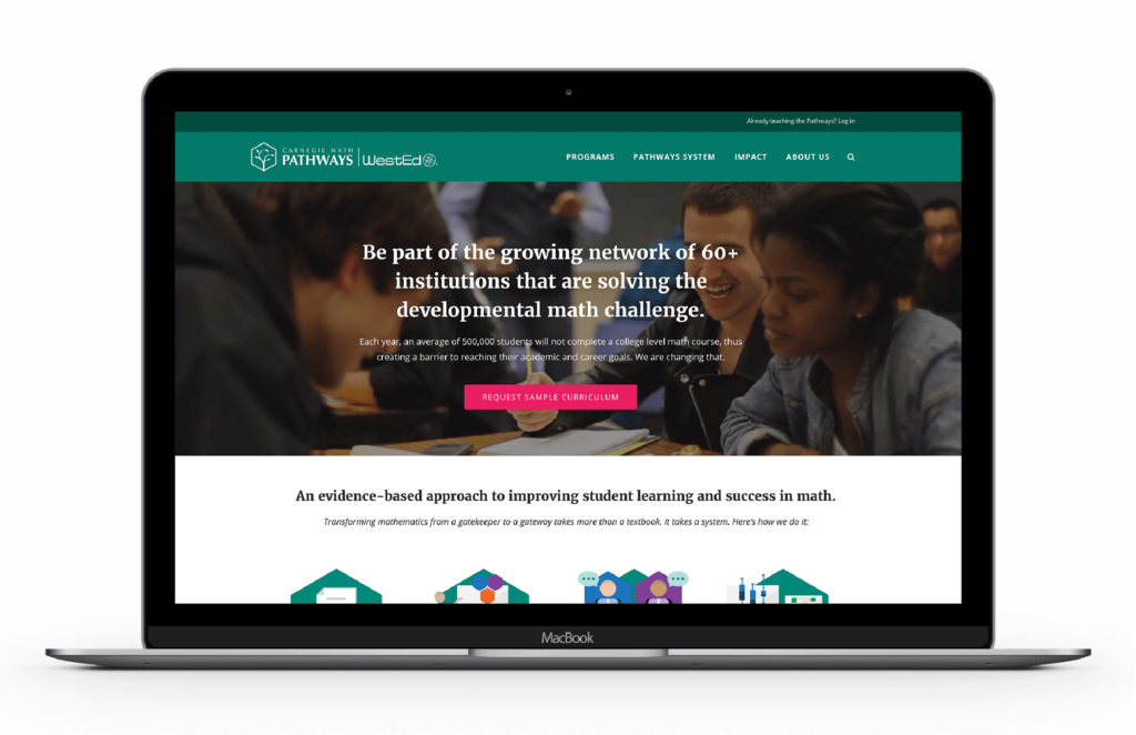
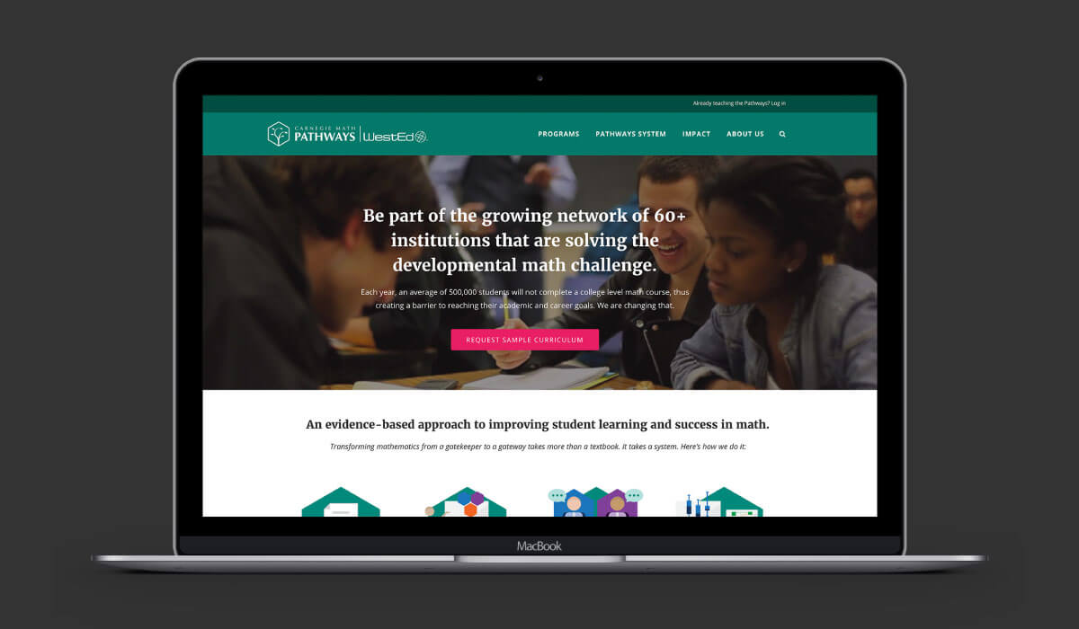
As a separate project, I led the design of the Pathways website to engage new users, nurture current network members, and build an online presence.
Designing marketing and research materials
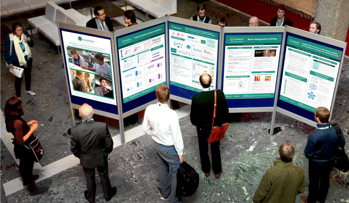
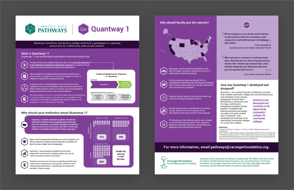
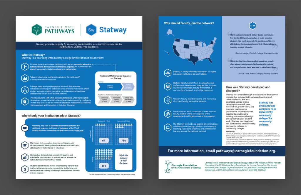
Because the Carnegie Math Pathways was quickly scaling and spreading to colleges and universities across the U.S., I designed materials that were presented to different stakeholders and policy makers across different areas of the higher education landscape (i.e., national and international conferences, U.S. Department of Education).
Style Guide
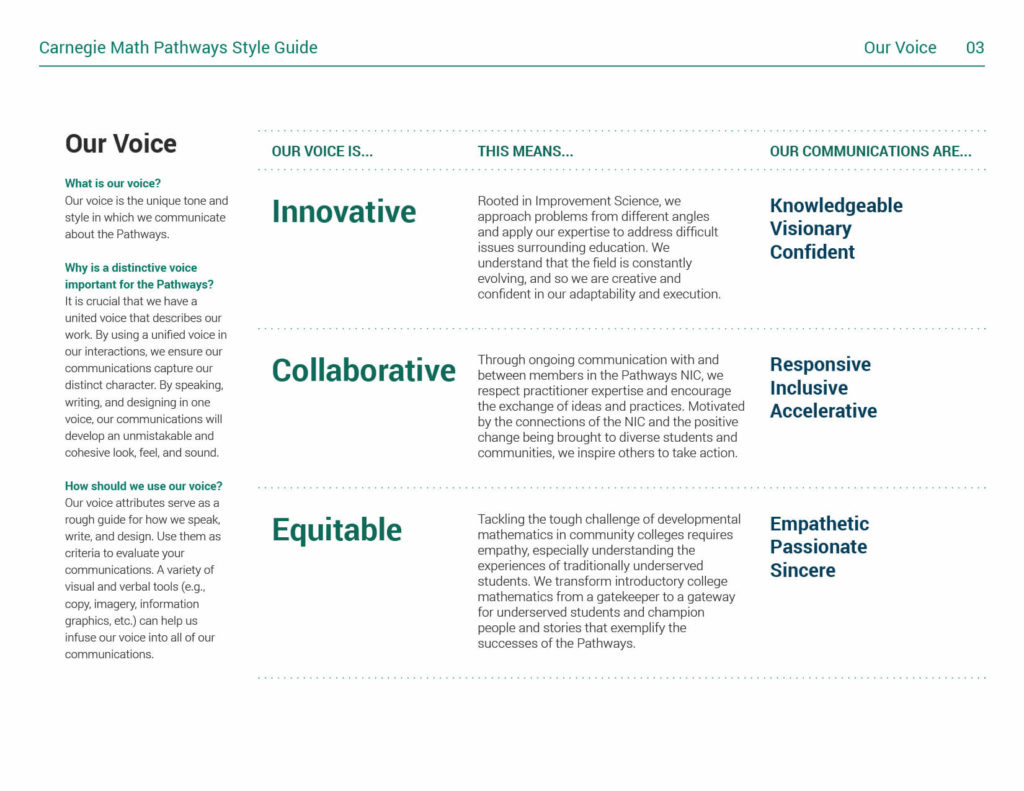
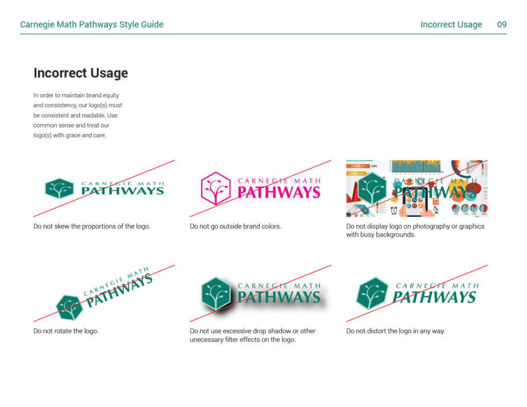
The style guide serves as a reference for other designers, and is a rough guide for how educators and advocates speak about the Pathways. It is also used to onboard new network members to the mission of the Pathways.
Moving Forward
In October 2017, the Carnegie Math Pathways transitioned to WestEd, a nonprofit agency working to improve education and other important outcomes for children, youth, and adults. The Pathways visual identity has remained intact and has gone through minor visual updates to reflect its new home with WestEd.

Reflections
- Involve key stakeholders early and often. For me, getting buy-in from stakeholders early on was key, as it provided a space for everyone's opinions to be heard. To ensure more collaborative decision making, I had to be intentional in involving stakeholders in my design process. Branding workshops and design critiques became my best friends.
- Help people help themselves. The designs and assets I created are only useful if people can actually access and use them. Instead of focusing primarily on beautiful static deliverables, I thought more about how people would access the designs and iterate on them over time. I took advantage of Google Drive's version control features to make sure my design assets stayed up to date and was accessible to the team. I also held meetings where I taught team members how to use basic tools in Adobe Illustrator so that they could modify my templates to fit their needs.
Credits
- Christopher Thorn, Content and knowledge management
- Jojo Manai, Mentor and thought partner
- Lisa Savčak, File management and communications
- Robert Gutierrez, Lead Web Developer
- Karon Kilpple, Executive Director of the Carnegie Math Pathways
© Copyright Kenneth Fernandez 2019. Designed with ♥︎ in San Francisco, California.
